Member-Only Post
Brand Colors Secrets Cheatsheet with AI
How to stop choosing colours by taste — and start using them as a strategic signal that shapes trust, emotion, and buying perception.
Most businesses do not choose their brand colours strategically.
They choose them because they personally like blue. Or because red feels bold. Or because a designer said it looks modern.
But your audience is not reacting to your colour choices as decoration. They are reacting to them as signals.
Before people read your headline, understand your offer, or compare your pricing, they are already forming an impression of your brand. Calm or chaotic. Premium or cheap. Safe or risky. Friendly or cold.
That is why brand colours matter more than many business owners realise. Colour is not just a design decision. It is a positioning decision.
Your brand colours are either reinforcing your message — or quietly working against it.
Why this matters in business
When your colours send the wrong message, the disconnect creates friction.
A financial advisory brand that looks playful may weaken trust. A wellness brand that feels too corporate may lose warmth. A premium service brand using random, noisy colours may reduce perceived value.
This does not mean every industry must use the same colour palette. It means your colour choices should support how you want to be perceived.
That is the real question: what should people feel when they encounter your brand?
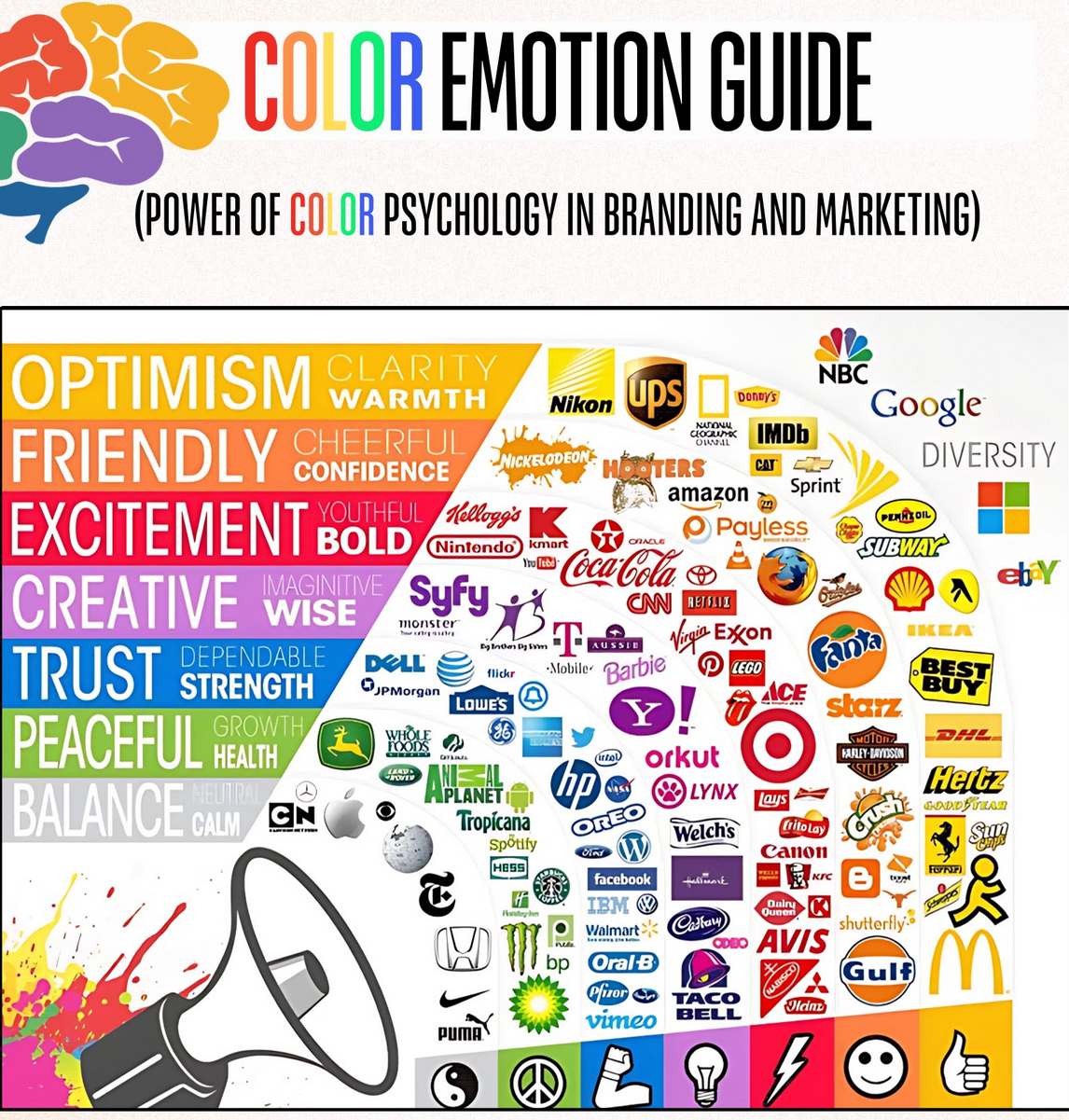
What your colours may be signalling
| Colour | Common emotional signal | Often useful for |
|---|---|---|
| 🌿 Green | Growth, harmony, wellness | Health, sustainability, coaching, lifestyle brands |
| 🌊 Blue | Trust, honesty, stability | Finance, tech, consulting, B2B services |
| 🖤 Black | Sophistication, prestige, mystery | Luxury, premium positioning, personal brands |
| 🔥 Orange | Ambition, excitement, innovation | Startups, education, energetic campaigns |
| 💖 Pink | Compassion, playfulness, sweetness | Lifestyle, beauty, community-driven brands |
| ☀️ Yellow | Happiness, friendliness, curiosity | Youthful brands, creative education, cheerful consumer brands |
| 🔮 Purple | Creativity, intrigue, mindfulness | Creative experts, transformation brands, premium learning |
| ❤️ Red | Thrill, intensity, power | Bold campaigns, retail, urgency-driven marketing |
The real branding mistake
The biggest mistake is not choosing the “wrong” colour.
The biggest mistake is choosing colour without first deciding your message, market position, and emotional intent.
When branding starts with aesthetics alone, it becomes disconnected from strategy. Your visuals may look nice, but they may not be doing the job of building trust, attracting the right audience, or supporting your offer.
That is why colour selection should come after clarity on three things:
- What do you want your brand to stand for?
- What should your audience feel when they see you?
- What perception will help your offer sell more easily?
How AI can help you choose better brand colours
AI will not replace brand judgment. But it can help you think more clearly and faster.
You can use AI to evaluate whether your current colours match your positioning, audience expectations, and desired emotional response. It can also help you compare different directions before you spend time redesigning your visuals.
This is especially useful for SMEs, consultants, coaches, trainers, and service businesses that want their branding to feel more intentional without hiring a full brand strategist immediately.
AI Prompt to audit your brand colours
Paste this into ChatGPT:
A simple way to think about colour strategy
Do not ask: What colours do I like?
Ask instead:
- What feeling must my brand create within 3 seconds?
- What colours would make my audience trust me faster?
- Does my palette support my positioning — expert, premium, warm, innovative, dependable?
That shift changes branding from decoration into decision architecture.
A practical example
Imagine two business coaches offering similar services.
One uses random bright colours, inconsistent fonts, and a logo that feels playful but unclear. The other uses a calm, confident palette with strong contrast and consistent application across slides, website, and social content.
Even before reading their credentials, most people will assume the second brand is more credible, more premium, and more organised.
That is the commercial value of brand coherence.
Use this as your decision filter
Before finalising your brand colours, ask:
✅ What emotions do I want my audience to feel?
✅ Which colours align with my message?
✅ How do I want my brand to be perceived?
Your colours are not a small visual detail.
They are part of your silent sales system.
Used well, they can strengthen trust, sharpen positioning, and make your brand feel more aligned. Used poorly, they can confuse your audience before your message even has a chance to land.
Your brand colours are either attracting the right people — or quietly pushing them away.
Reflection: Does your current brand colour palette match the message your business wants to send?