How to Use AI to Create a Calm, Trustworthy Brand Guide for Your Business
Stop guessing your colours, fonts, and Canva direction. Use AI as a strategic guide to build a brand system that feels clear, premium, purposeful, and consistent across your social media, presentations, website, and lead magnets.
Best answer: AI should not decide your brand for you. It should help you think more clearly, define your brand traits, translate them into visuals, and create a practical brand system faster. The strongest brand guides start with strategy first, then use AI to organise your colours, typography, layouts, templates, and usage rules into something your business can apply consistently.
Why a brand guide matters more than ever
Most SMEs do not have a creativity problem.
They have a clarity and consistency problem.
Their website feels different from their slides. Their social posts look disconnected. Their lead magnets and event visuals do not feel like they came from the same business.
That is not just a design issue. It is a trust issue.
When your brand feels inconsistent, people question whether your business thinking is consistent too.
A simple brand guide helps your business look more intentional, feel more trustworthy, and scale your content without redesigning everything from scratch each time.
DigitalAI principle: In a world of noise, clarity is a competitive advantage.
What AI should do in branding
AI should not replace brand thinking.
AI should help you:
- clarify your positioning
- define your brand personality
- translate your values into visual direction
- turn scattered ideas into structured brand decisions
- generate first-draft options faster
- create repeatable guidance your team can actually follow
In other words, AI is the assistant. Strategy is still the boss.
What AI should do
Help you think clearly, compare options, document decisions, and build a practical brand system that supports execution.
What AI should not do
Push you into trendy visuals, random colours, generic copy, or a brand identity that looks polished but says nothing meaningful.
Step 1: Start with 3 brand traits
Before choosing colours or fonts, define the three qualities your brand must consistently communicate.
For example:
- Calm
- Trustworthy
- Modern
These three words become your decision filter. Every time you create a post, brochure, slide, workbook, or landing page, ask: Does this feel calm, trustworthy, and modern?
Act as a brand strategist. My business serves [target audience]. My offer is [offer]. I want my brand to feel calm, trustworthy, and modern. Based on this, suggest how these traits should show up in visuals, tone, layout, and customer experience.
Step 2: Define your visual vibe
Traits describe the feeling. Your visual vibe describes the creative direction.
A strong brand guide needs both.
For DigitalAI-style positioning, that usually means a look that is premium, energetic, purposeful, and clean. Not cluttered. Not cold. Not overdone.
Your visual direction might include:
- structured layouts
- generous whitespace
- rounded cards and pill CTAs
- pink-purple accents used intentionally
- modern, highly legible typography
Based on these brand traits: calm, trustworthy, modern, suggest 3 visual vibe directions for my business. For each, explain the mood, colour direction, layout style, typography feel, image style, and what to avoid.
Step 3: Build a colour system, not just pick favourite colours
One of the biggest mistakes SMEs make is choosing colours emotionally without assigning roles.
A practical brand system needs colour jobs such as:
- Primary
- CTA / Accent
- Secondary support
- Tertiary highlight
- Light fill
- Background tint
- Dark text
- Secondary text
Consistency comes from rules, not taste.
When each colour has a role, your Canva visuals become much easier to repeat and scale.
Act as a brand system designer. Create a calm, trustworthy, modern colour system for my business. Suggest 1 primary colour, 1 CTA colour, 1 secondary colour, 1 tertiary colour, 2 light fill colours, 1 main text colour, and 1 secondary text colour. For each, give HEX codes, role, and usage rules.
Step 4: Choose fonts that support trust
You do not need many fonts. You usually need two.
- One for headings
- One for body text
The key test is simple: can people read it quickly and comfortably on desktop and mobile?
A strong combination is often a geometric sans-serif for headings and a humanist sans-serif for body copy. That gives you authority in headlines and warmth in reading flow.
Recommend 3 heading and body font pairings for a brand that should feel calm, trustworthy, modern, strategic, and approachable. Explain why each pairing works and where it may not fit.
Step 5: Standardise layout rules
A trustworthy brand often looks disciplined.
That means deciding:
- how much whitespace you use
- how sections flow
- how cards and content blocks are styled
- how headings and subheadings appear
- how your CTA buttons look
- how many visual ideas belong on one page
Modern brands are usually not crowded. One clear message is often stronger than trying to say everything at once.
Create simple brand layout rules for a business that wants to look calm, premium, strategic, and modern. Include whitespace, section spacing, card style, CTA shape, text hierarchy, and social media post structure.
Step 6: Create Canva templates that enforce consistency
Canva works best when it becomes a brand execution system, not just a design playground.
Create a small set of templates such as:
- social media post
- carousel
- lead magnet cover
- worksheet page
- event poster
- presentation cover
The goal is not endless variety. The goal is recognisable consistency.
Help me define 5 Canva template types for my business. For each template, specify purpose, text hierarchy, visual layout, CTA placement, and what must stay consistent across all designs.
Step 7: Keep a brand history page
A brand guide is not only a design document. It is also a decision record.
Create one page where you track:
- your brand traits
- your visual vibe
- your approved colours
- your font choices
- your CTA styles
- your layout rules
- your do’s and don’ts
- examples of on-brand and off-brand use
- dates of major updates
This helps you avoid brand drift and makes it easier for team members, freelancers, and future collaborators to stay aligned.
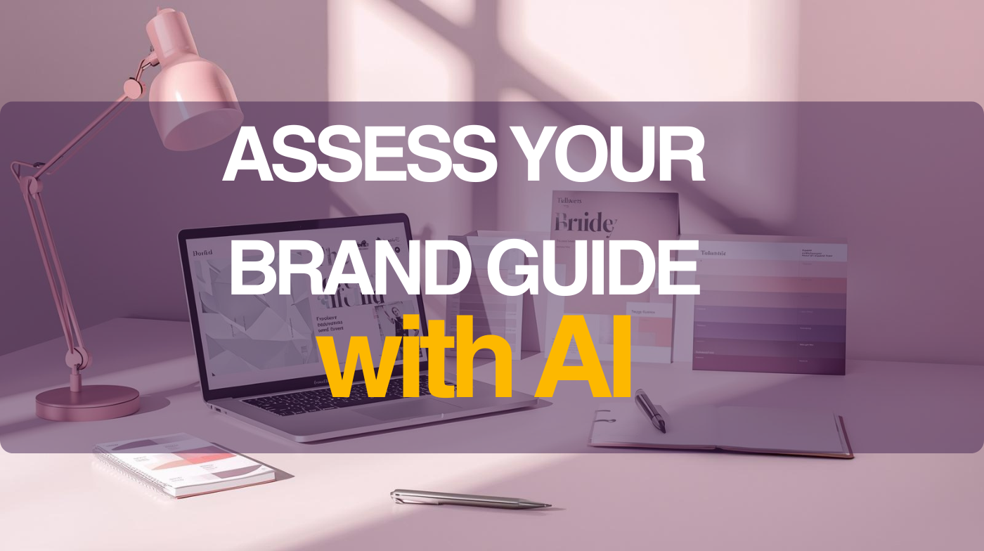
Assess Brand Strategist Guide
Use this free assessment access to explore how AI can guide your brand clarity, content consistency, visual direction, and business positioning.
Free assess for 2 days only. After that, it will be back to member-only content.
Assess Brand Strategist GuideFrequently Asked Questions
Can AI create my full brand guide for me?
AI can help you draft, compare, and structure your brand decisions quickly. But the best brand guide still comes from business clarity, positioning, and leadership judgment.
Do I need a brand guide if I am still a small business?
Yes. Small businesses often need consistency even more because every touchpoint shapes trust. A simple guide helps you look more professional without making branding overly complicated.
What should come first: strategy or design?
Strategy comes first. Define who you serve, how you want to be perceived, and what your brand should communicate before finalising colours, typography, or Canva templates.
What should a practical brand guide include?
A useful starter guide should include brand traits, colour system, font pairings, layout rules, CTA style, template examples, and clear do’s and don’ts for consistent use.
Can I use this process inside Canva?
Yes. In fact, Canva becomes much more effective once your brand rules are clear because you can create repeatable templates instead of redesigning everything every time.